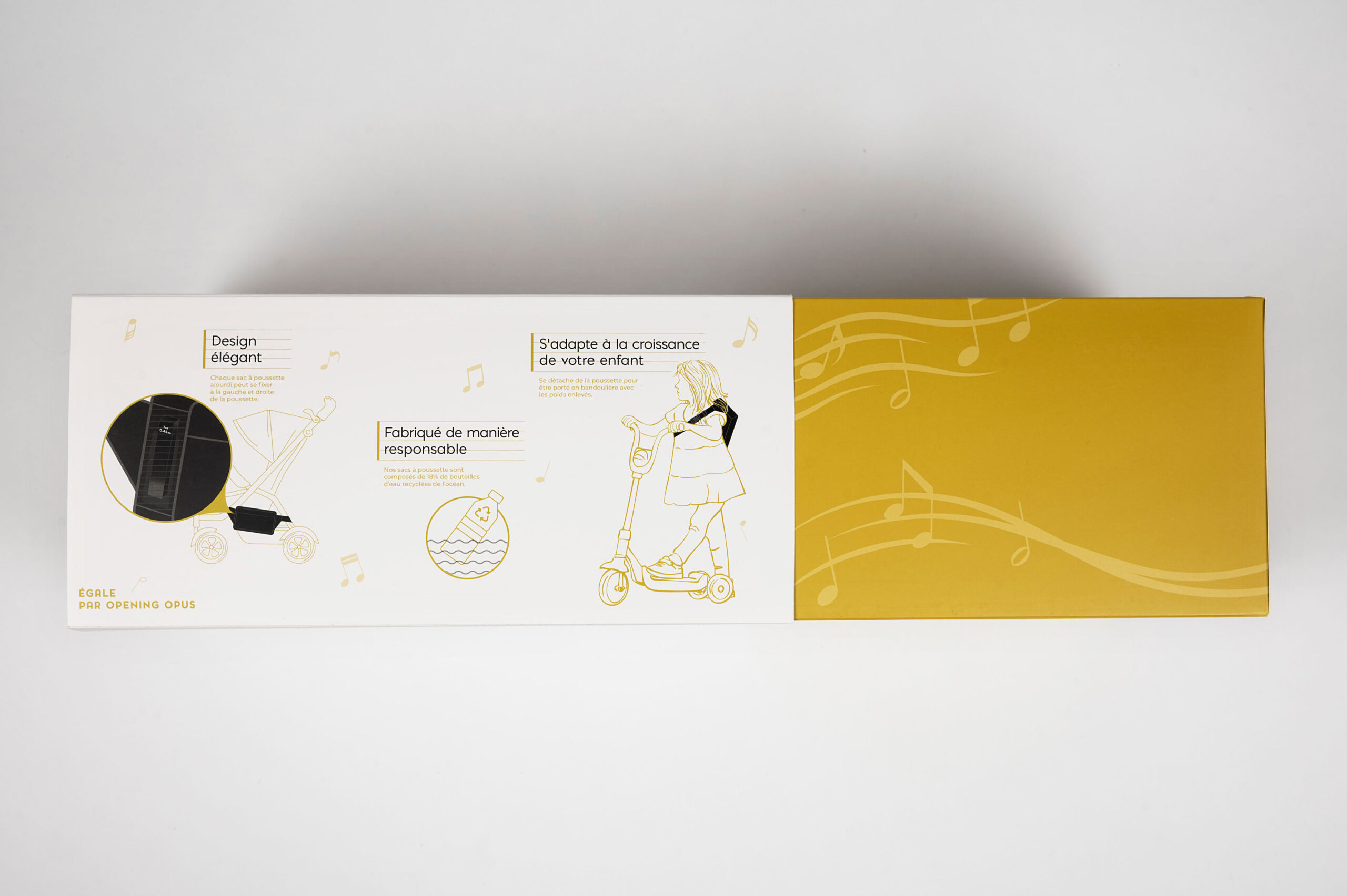
When Opening Opus came to us to design bilingual English-French packaging for their Égale product, we were happy to oblige. We landed on a sophisticated design solution that created a premium experience opening the product while working within a reasonable production cost. Custom vector illustrations illustrating how to use the product at different stages of your child’s life adorn each side of the drawer box sleeve. Leveraging the brand’s emphasis on music, we wrapped music notes and bars around the inner drawer.
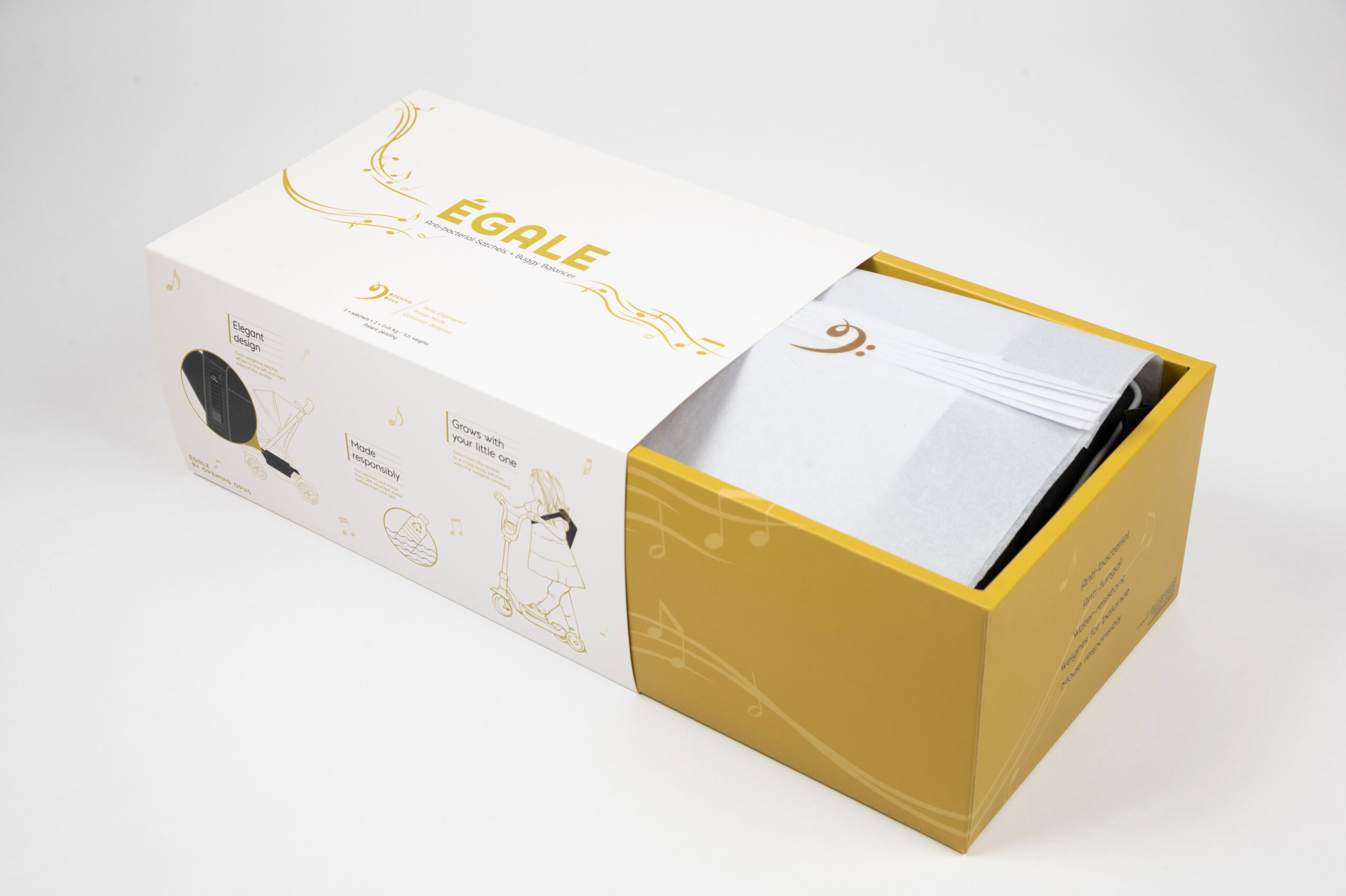
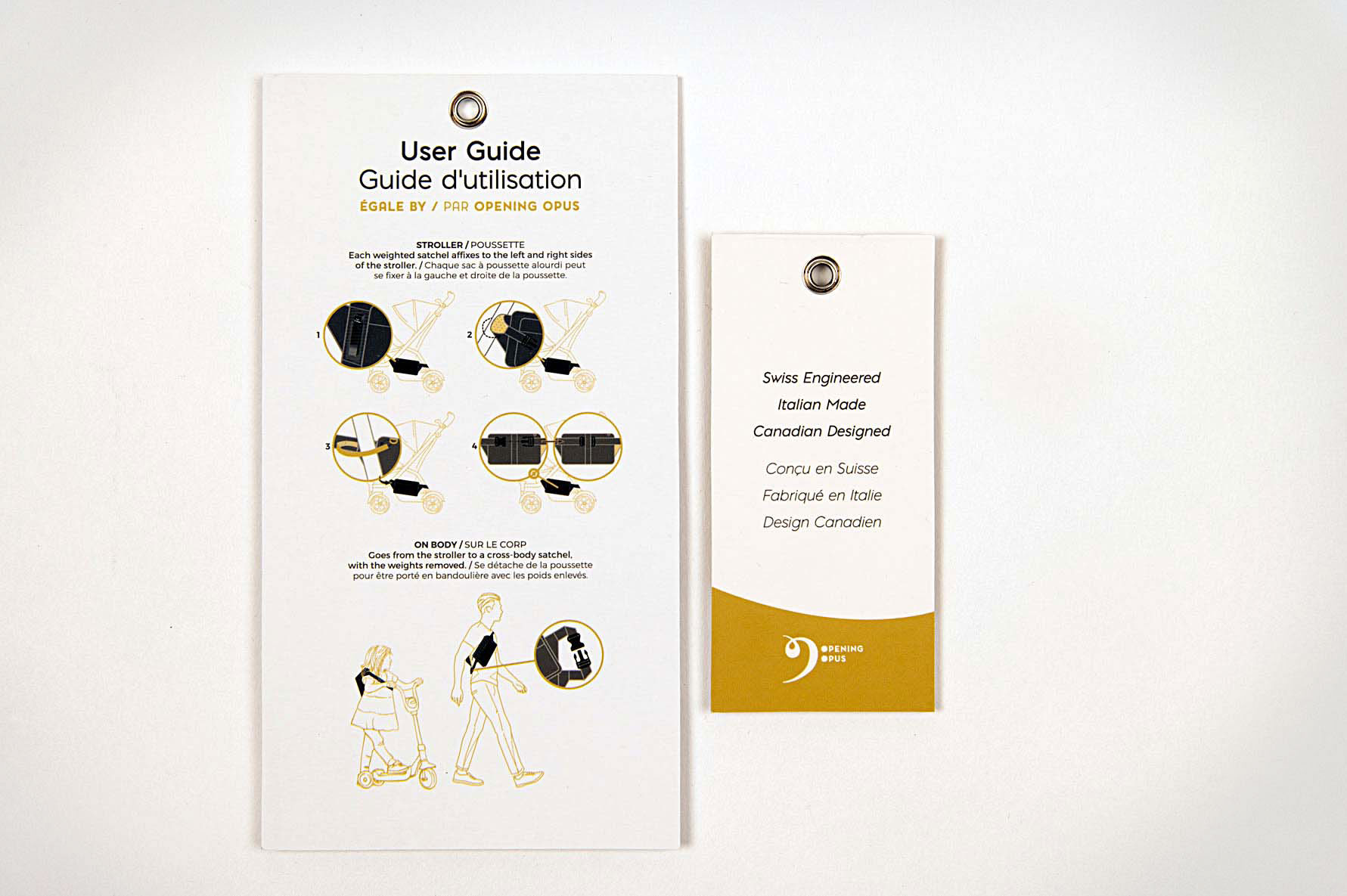
Égale is a solution to the problem experienced by many parents: a tipping stroller. The weighted satchels affix to either side of the stroller, giving the stroller additional heft so that the parent doesn’t have to worry about their child getting injured by a tipping stroller. The product is quite niche in that it lives in the parent-child product and lifestyle world. The packaging design communicates how to use the product safely with custom illustrations while also extending the brand’s premium look and feel.
The packaging makes the product’s purchase and delivery an absolute treat. While the consumer is discovering the usefulness of the product, they are also excited about receiving an item that has been well-designed with thought and care.
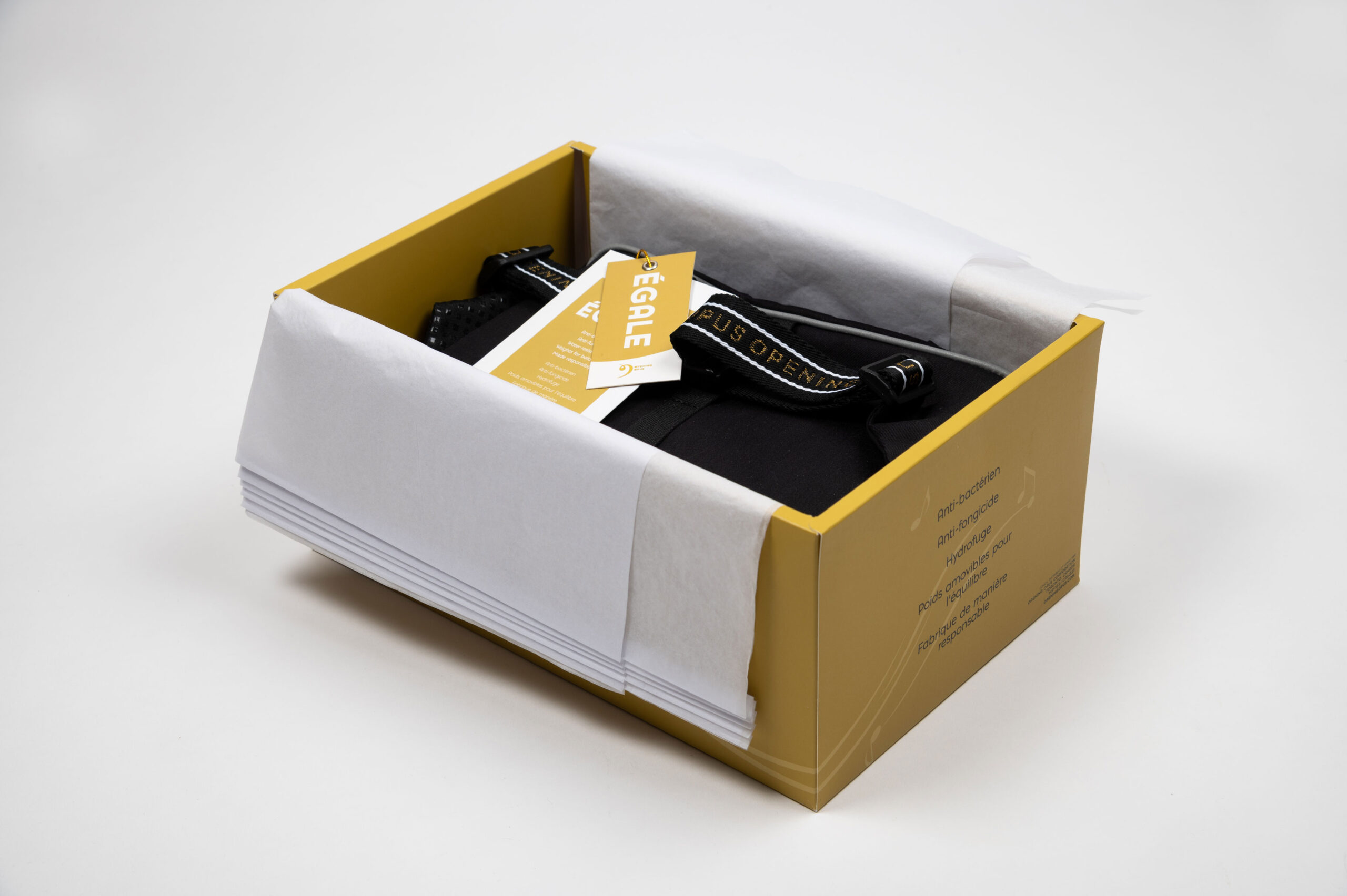
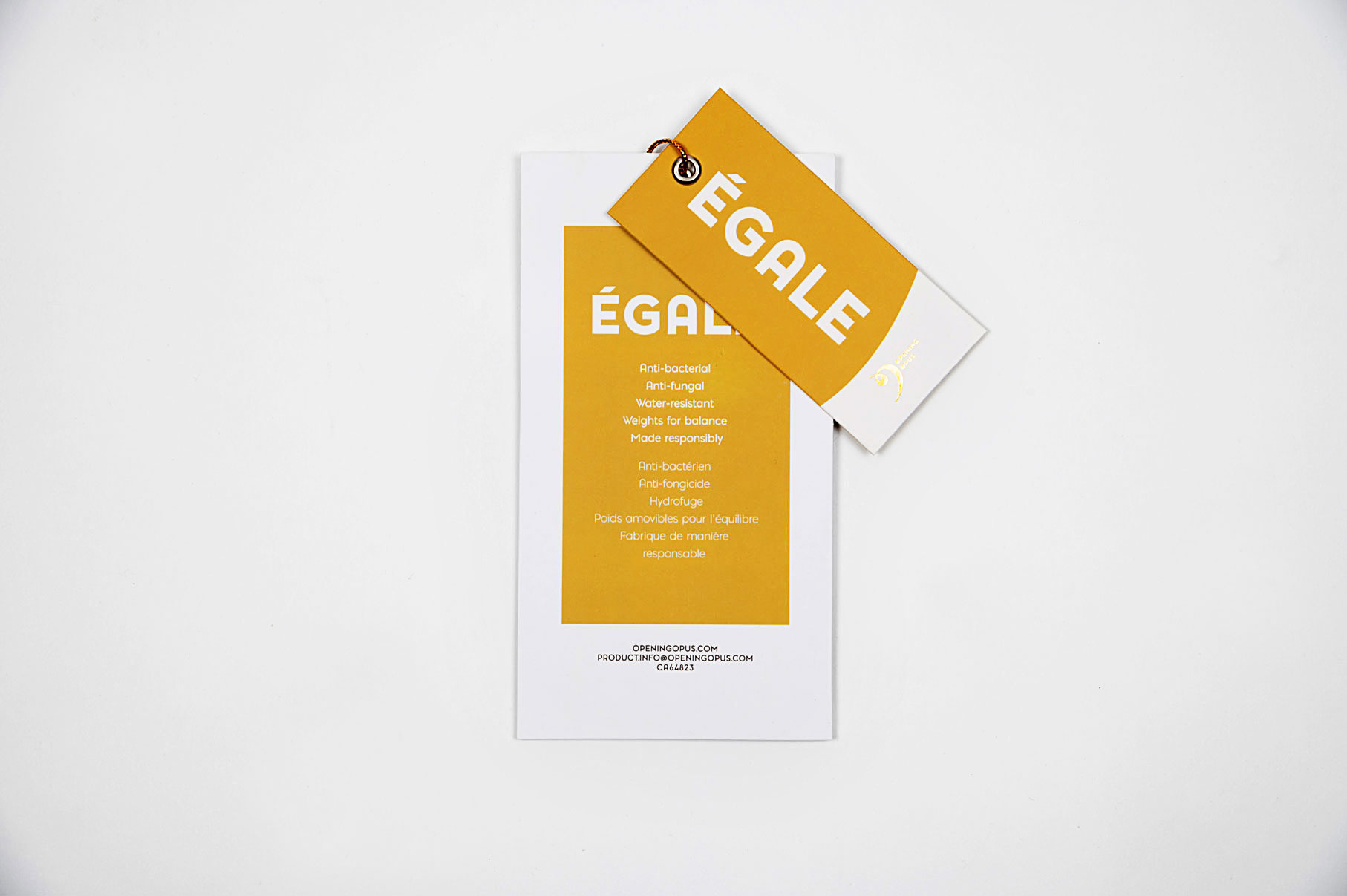
We were most excited to design the labels because it’s such a great way to communicate Opening Opus’ ethos via a tactile brand touchpoint. We drew on our love of well-made fashion labels found in high-end clothing boutiques.
Client
Opening Opus
Designer
Jen Spinner
Illustration
Tomomi Lo
Photography
Ken Chou

