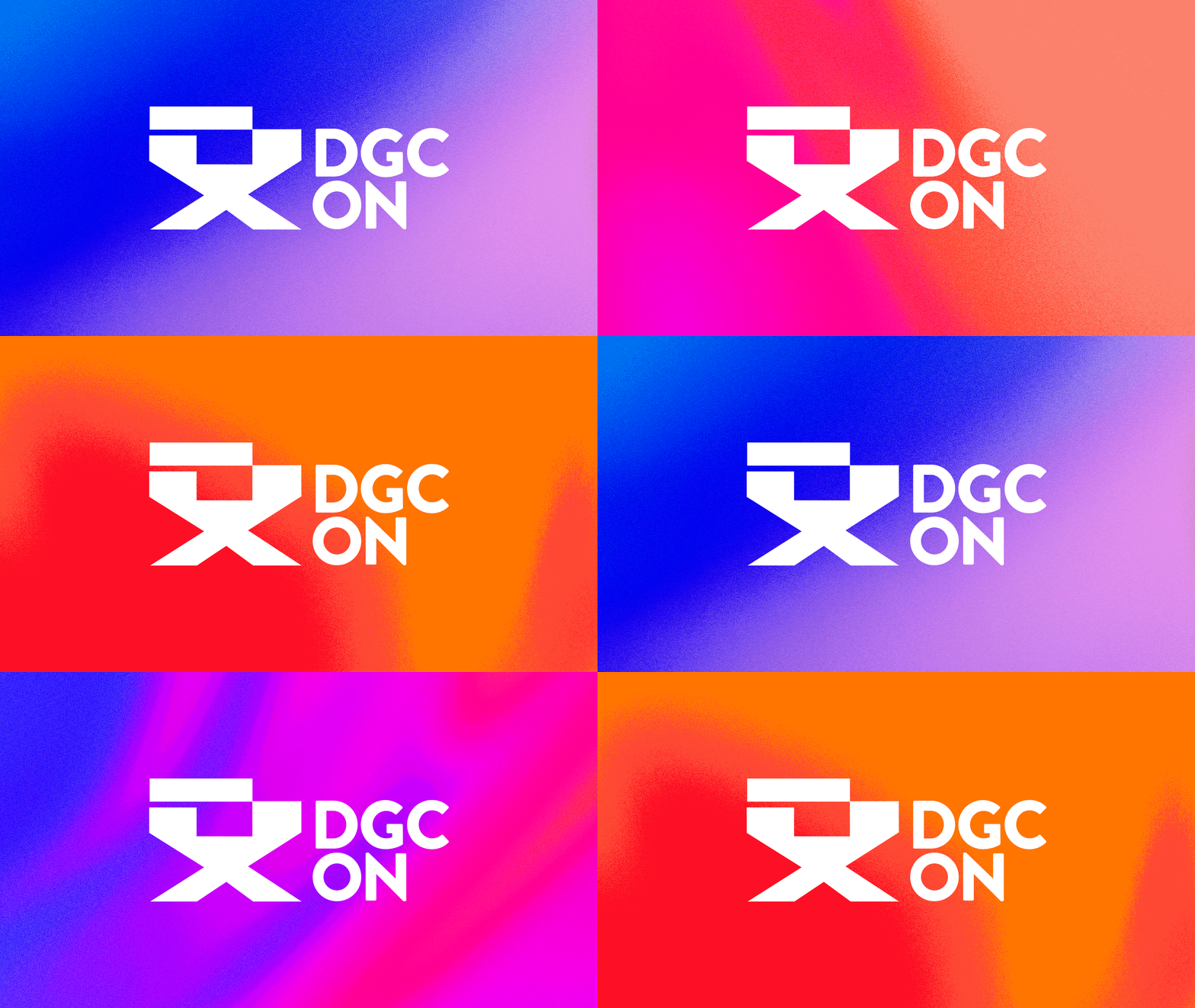
The Directors Guild of Canada — Ontario came to us recently and wanted to refresh their visual identity. Much of their current identity was working for them but some wasn’t. We assessed their needs and executed a plan to refresh their visual brand identity.

The most striking change was an update to a visual element they used called “the burst.” Even though we all agreed it was beautiful, the element was difficult to work with. As a long-time client of Spinner Design, we understood the essence of “the burst” represented key aspects of DGC ON’s visual identity. DGC ON represents different professions in the film & television industry from creatives to location managers and their visual identity needed to include all of those varied yet related professionals. We created bold and bright gradient backgrounds that became a really flexible aspect of the look and feel. Our nimble team updated their logo suite to include bilingual, monogram and avatar versions creating a strong visual identity.

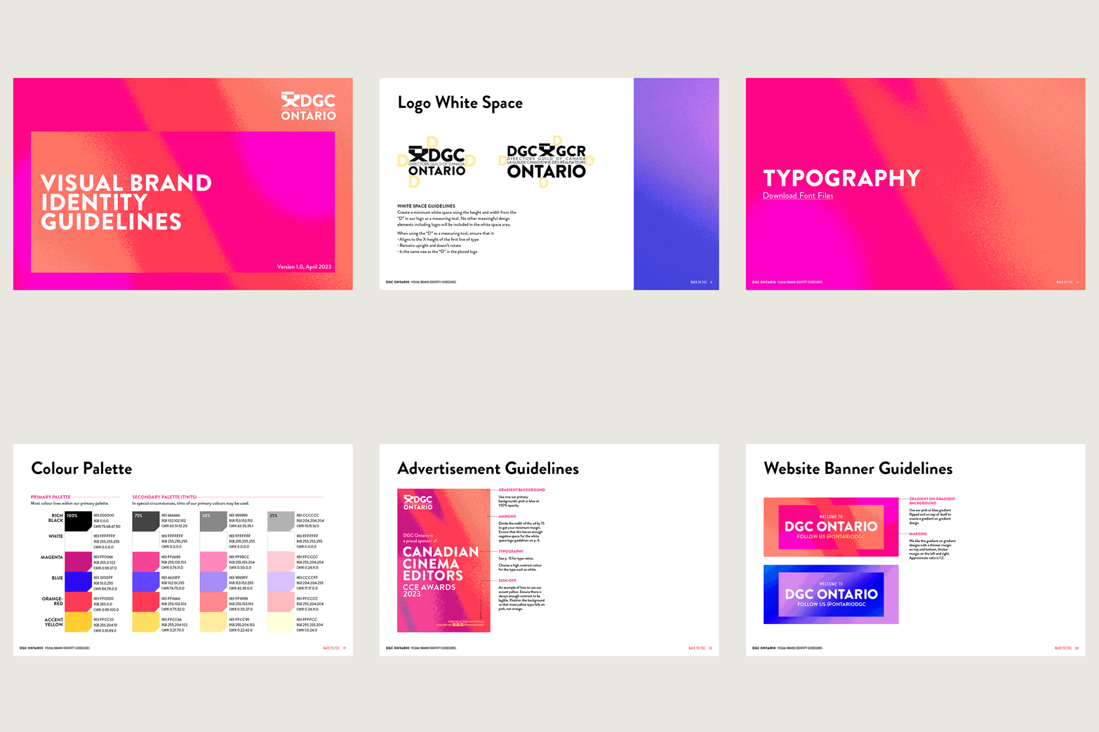
Creating a visual brand identity includes custom brand guidelines that are clear and concise. Below is a taste of DGC ON’s brand identity guidelines, including:
- Brand identity statement
- Logo usage: dos and don’ts
- Brand element design applications
- Colour Palette
- Typography Guidelines
Read a full case study of the DGC ON refresh over on our blog.
Client
Directors Guild of Canada — Ontario
Art Director
Jen Spinner
Designers
Jen Spinner
Abagail Maxwell

