For the past few years, we’ve been working with a lovely client, the Directors Guild of Canada – Ontario (DGC ON) on their branding and marketing needs. The Guild represents the interests of several categories of film and television professionals: from creative to administrative. DGC ON needed to create a brand identity refresh.
In our mind, a refresh is not a redesign. A refresh requires a reimagining of current identity collateral such as logos, colour palette and imagery. Usually when an organization decides to do a refresh, they are in a good place with their brand identity, but they know it could be better.
Whereas a redesign is a more intensive project that requires starting from scratch. Typically, an organization decides to do a rebrand of their visual identity when they’ve outgrown their old one. For instance, they offer new services and embody new values that aren’t reflected in their current identity.
In this case, DGC ON wanted a refresh. They required an additional bilingual logo along with an energized brand identity.
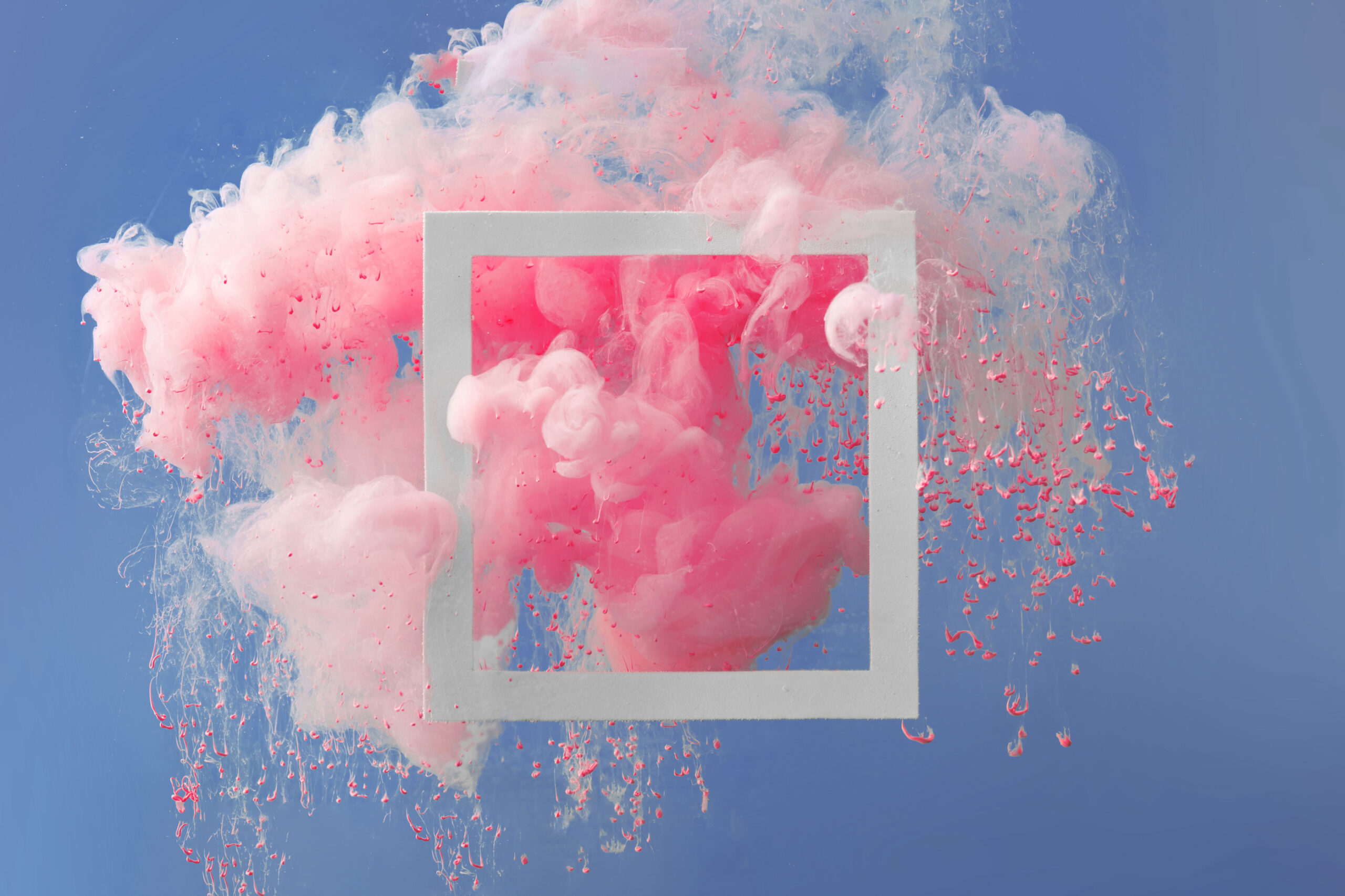
Since we’d been working together for several years, I knew the back story of their current visual identity. It leaned heavily on imagery that was called “bursts” that were created with a complicated process involving a in-camera effect. When the bursts were first introduced to their membership, it was well received. But, the imagery proved difficult to work with and started to look a bit dated.
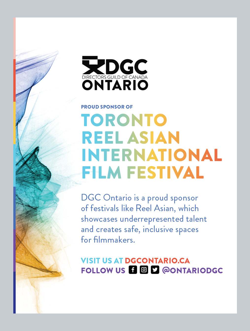
The original Directors Guild of Canada – Ontario was working well, but we all knew that we could push it into a more cohesive and exciting space!
Ultimately, the bursts represent creativity as well as representing all the different kinds of work that need to be done behind the scenes to make television and film. The meaning of the symbol is what we all loved, but not the symbol itself.
To replace the bursts, we landed on a series of gradient backgrounds that utilized various blocked designs. The new gradient backgrounds gave us an updated colour palette that was more limited that the previous palette. In this case, choosing fewer colours works to make DGC ON’s brand more cohesive.
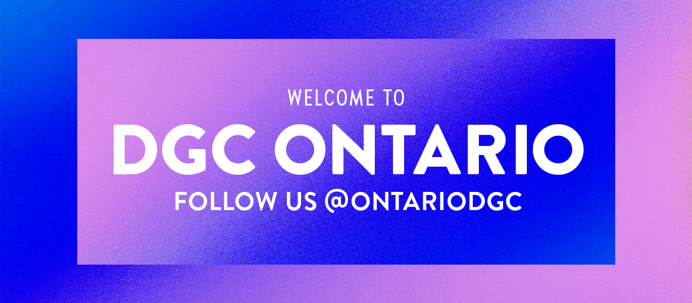
One of a series of gradient backgrounds and updated typography design for DGC ON.
We also updated their typography suite to include a condensed version of Brandon Grotesque. Typography is often the most cost effective way to create practical and beautiful identity tools. The condensed version is useful for mice (smaller) type where regular-width Brandon gets a bit clunky.
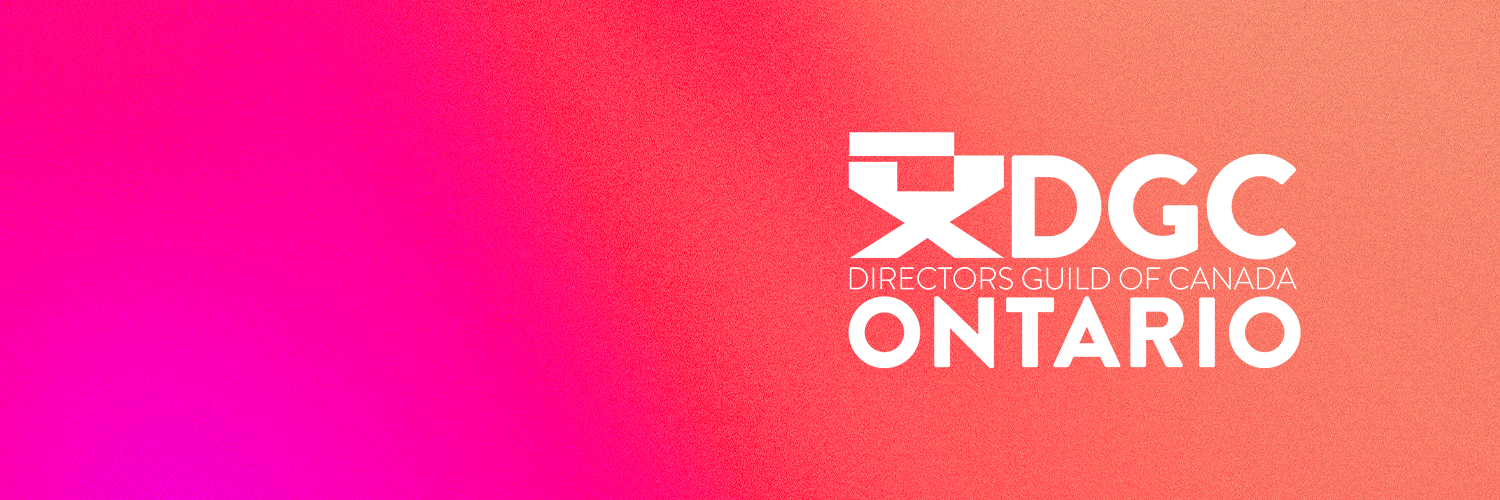
One of the things we love about working with clients on a long-term basis is that we get to know their ethos and visual taste really well. From start to finish, this project moved really smoothly because we did our homework and knew how to present useful concepts at each phase of the process.
— Jen Spinner, founder at Spinner Design

